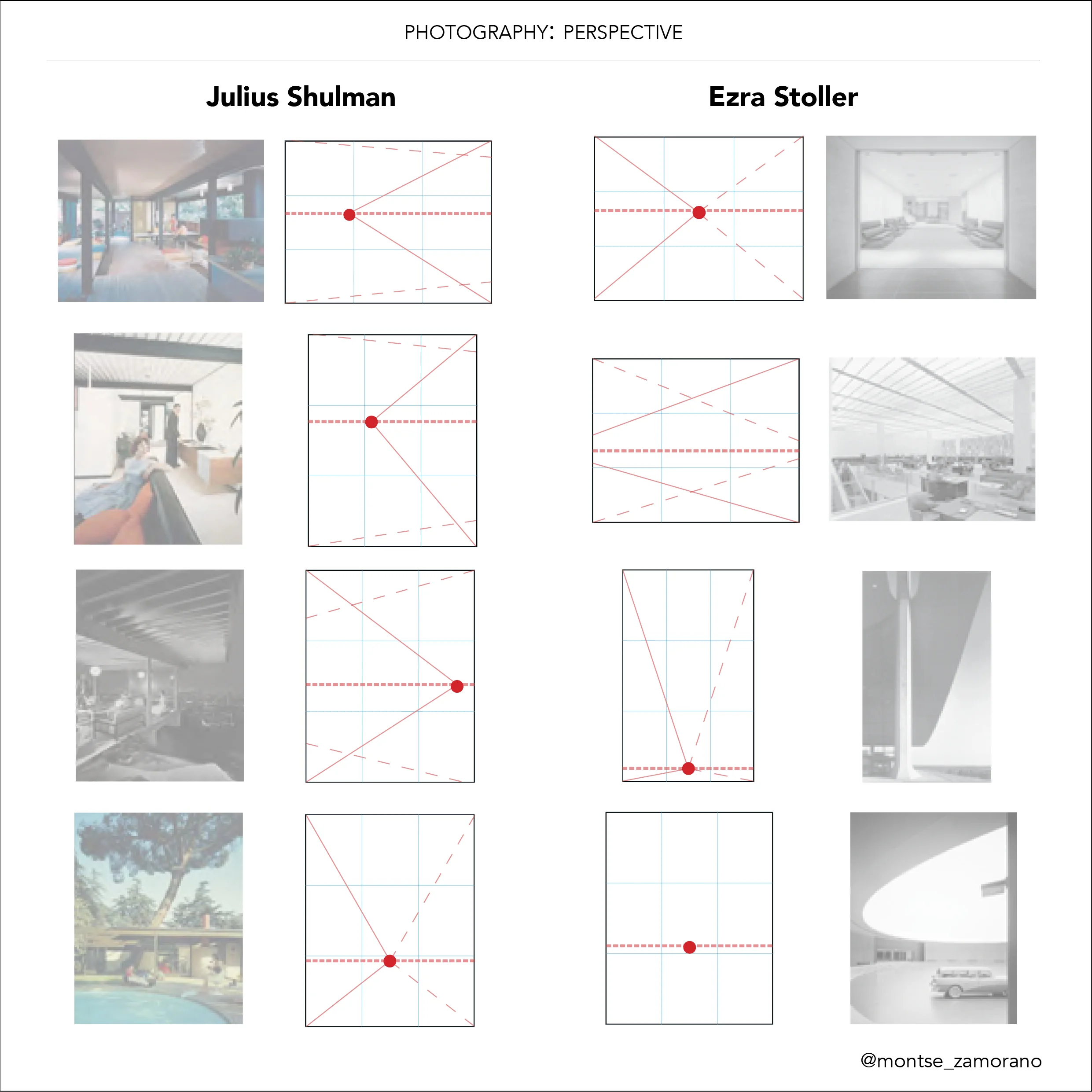
Julius Shulman and Ezra Stoller are two of the most important Architecture photographers of the XX century, two figures that were milestone in Architecture Photography. Their work and life has lots of points in common at the same time as differences. Both of them worked in the golden age for Modern Architecture, and some of their pictures have become symbols of that time. As part of my Final Thesis for the Master in Advanced Architecture projects at ETSAM, I tried to explain and analyze the specific characteristics of each photographer. Some of the insights and conclusions will be shared in this and other upcoming posts.
Analyzing a photographic image objectively is extremely difficult; we can appeal to its historical or contextual value, its originality or even its market value. However, each one of these parameters is again subjective and each photo presents a high complexity from the point of view of form, history, context, sociology or philosophy.
In the above comparison, photographs from Ezra Stoller and Julius Shulman have been abstracted into independent elements such as lines and planes. Each of these elements has a semiotic meaning, which is an implicit reaction in our senses. For instance, a horizontal line suggests stability, calmness or rest, whereas an inclined one suggests movement and dynamism. In the same way, a square suggests stability, perfection and constancy, and a circle vitality and drives the maximum attention.
LINES
Observing both sets of photographs, we can appreciate how in Shulman pictures inclined lines are constant and there is an almost absolute lack of horizontals. On the other hand, horizontal lines predominate in Stoller photographs.
There is a constant in Shulman pictures, where we find horizontal lines with a slightly inclination that creates a deliberate indetermination. This implies dynamism, restlessness and instability. When finding inclined lines in Stoller photos, this indetermination does not happen, as they are clearly inclined and usually balanced with another set of diagonals running in the other direction, so the composition ends up being balanced and static.
PLANES
Following the Gestalt psychological rules of perception, the mechanism of vision happens from general to particular through recognizing the dominant shapes in the image, and the simplest geometric shapes are the ones that we can easily recognize.
Looking at Shulman photos, we find irregular planes in all of his pictures, which are structural elements such as floors or ceilings, but also furniture, people or plants. Because the irregular shapes require a higher comprehension from the viewer, the structural elements rely in a second level, and all of our attention goes to the people and activities that happen in the pictures. Looking to Stoller, we can highlight the simplicity in the shapes that compose his photographs, making them very easy to read and bringing all of the emphasis into those visual elements, which are the structure of the building.


